Hey Neighbor
Hey Neighbor
Finding the Problem
Four participants were interviewed about their experiences moving to a new area
I discovered that my participants had the most trouble finding information and resources in a new areas
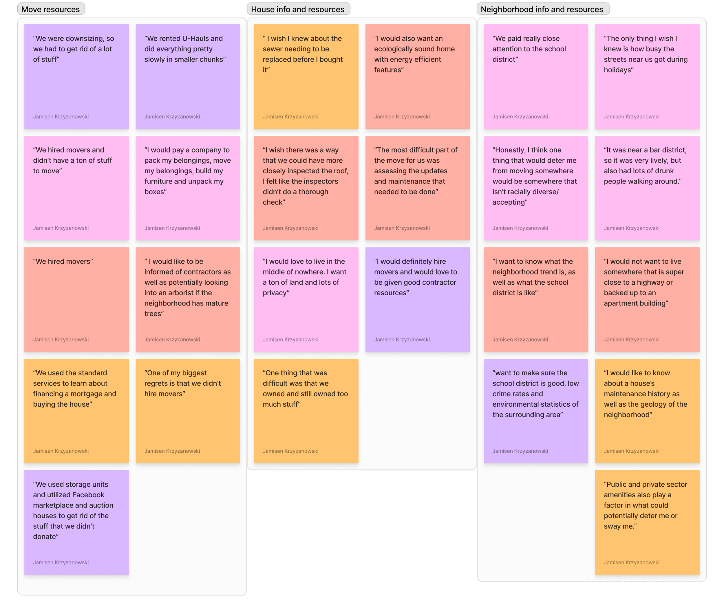
Though the interviews I was able to categorize their answers into three common groups
Move Resources
House info and Resources
Neighborhood info and
Resources
User Personas
using my research and user interviews I created 3 User personas to help show the goals, needs, motivations, and frustrations when trying to move to a new location
Project
UX/UI Development
Role
UX/UI Designer, Research
Platform
Mobile Website
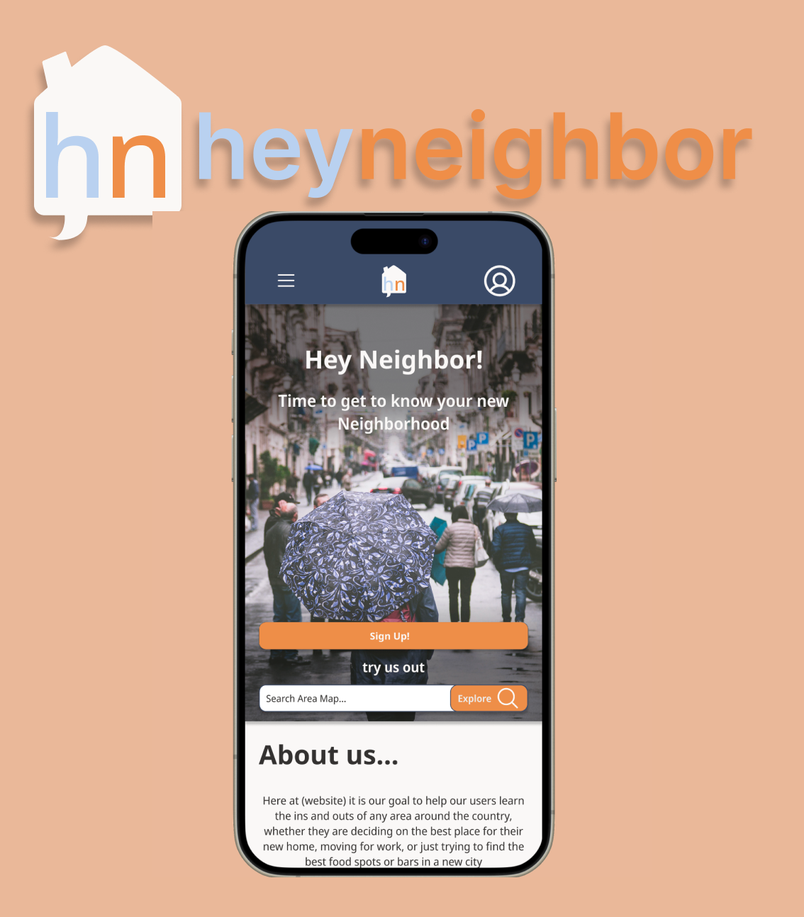
Hey Neighbor is a website dedicated making the daunting process of moving to a new and unfamiliar area as stress free and easy as possible for its users by giving them access to all of the information and resources that they might need to find their perfect new home
Product Features
Based on what I learned through my research and interviews, I came up with some key features to include in my product.
An "Ideal Area Quiz" that can help match the user with areas based on whats most important to them
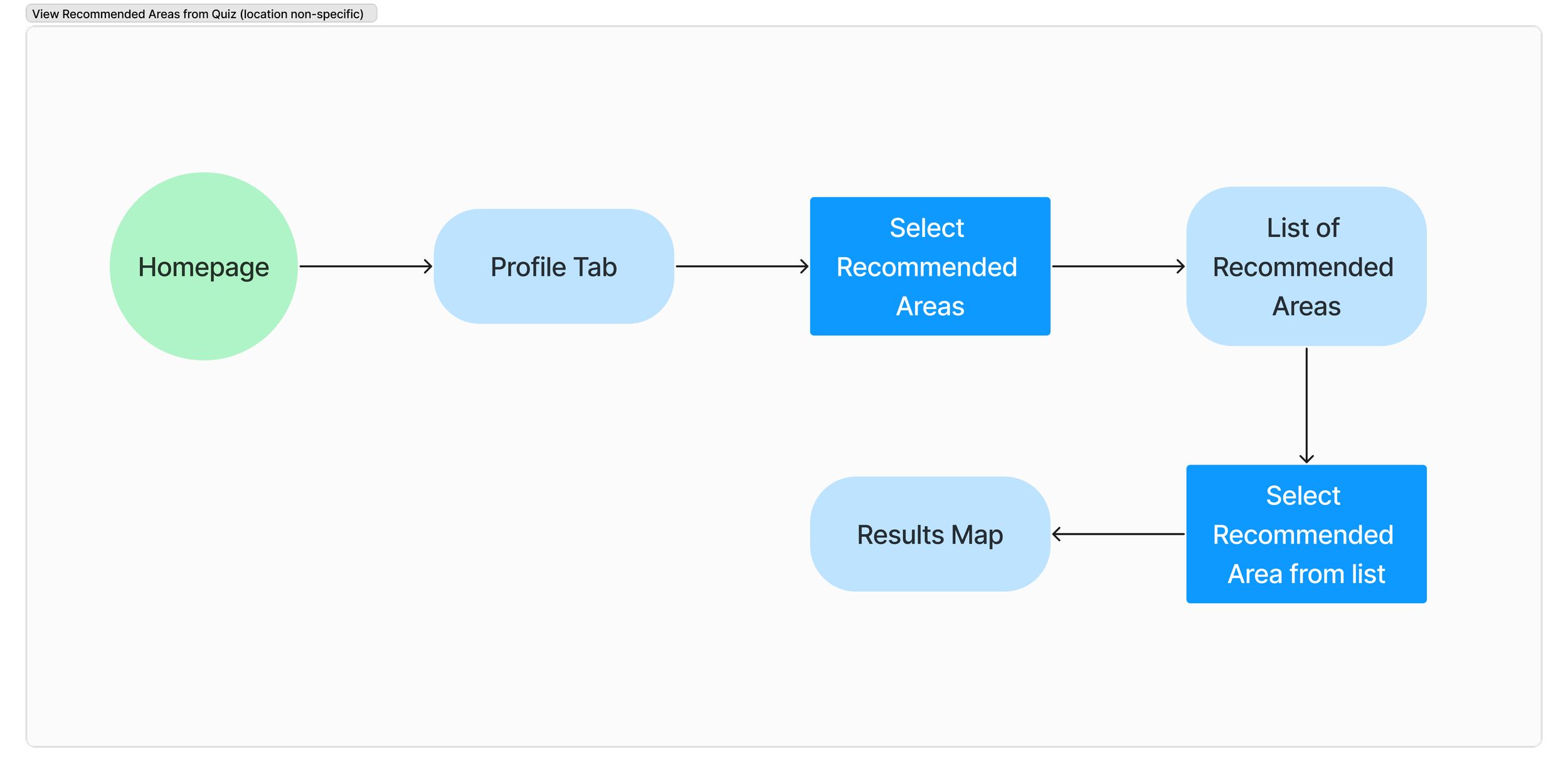
User Flows
Neighborhood and Area statistics to easily find if the area the user is looking at matches their lifestyle
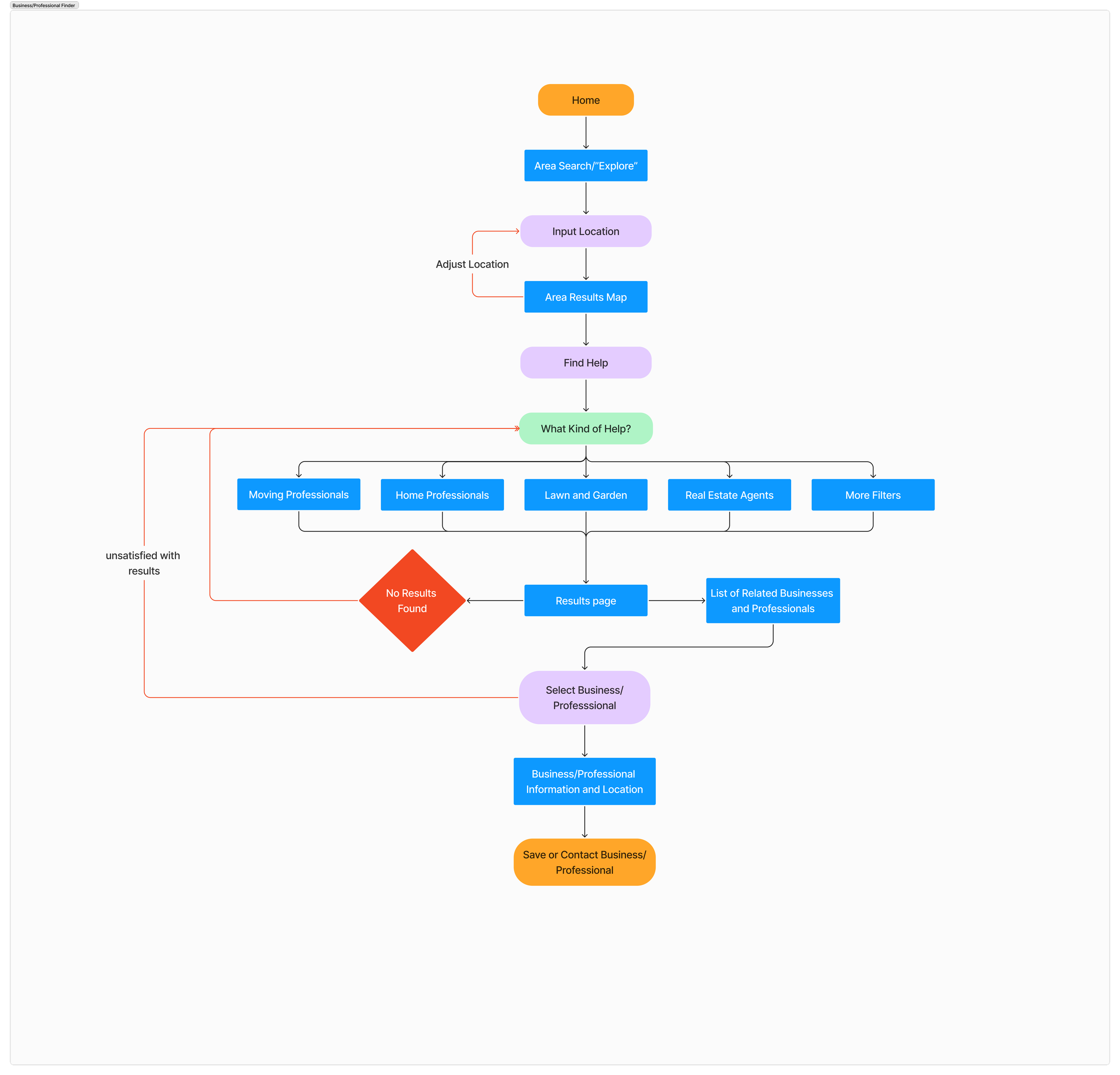
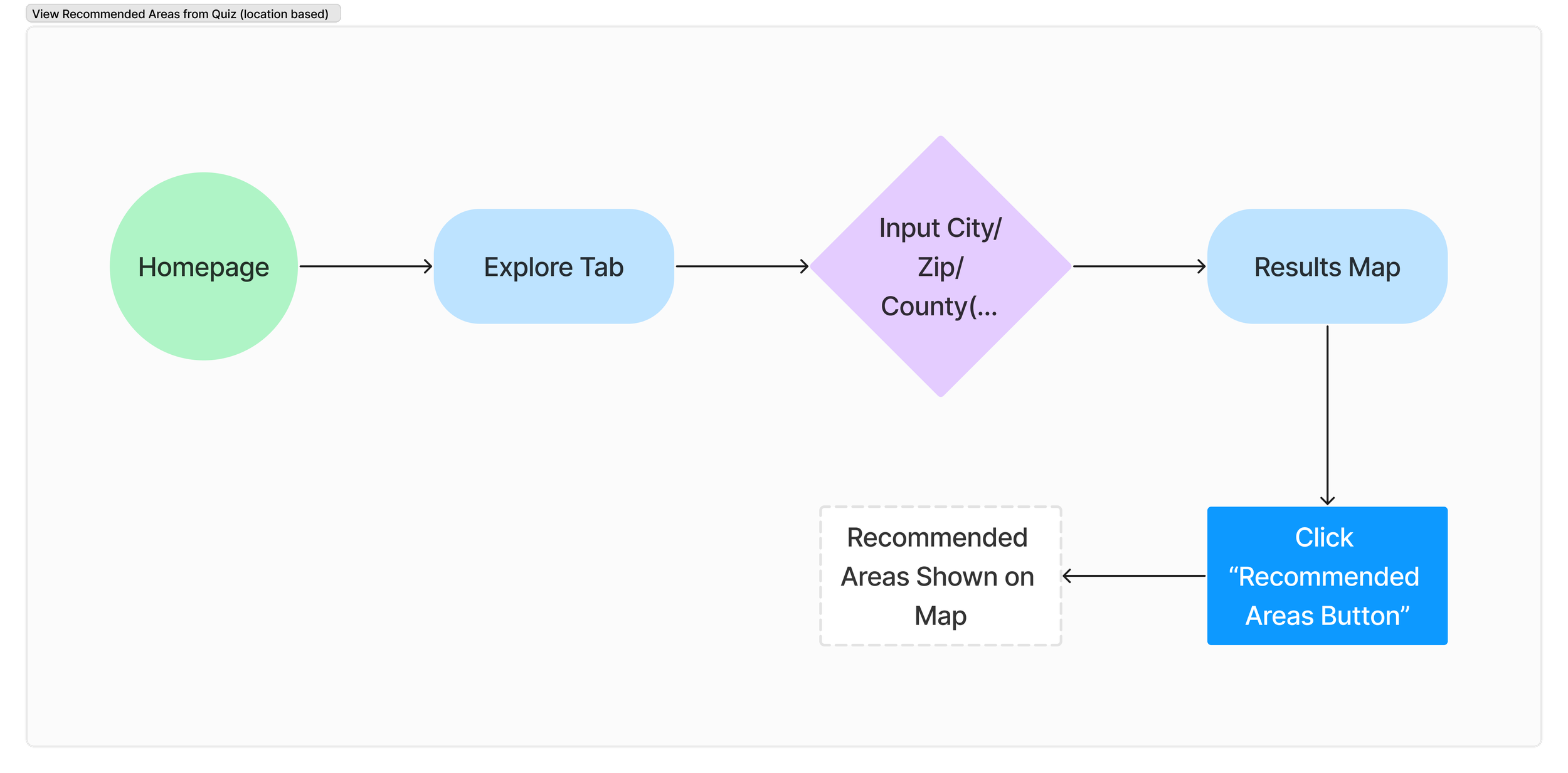
lused User flow to map out how someone would navigate my product to make it as easy and user friendly to use as possible
Task Flows
By using task flows I was able to map out how the user would complete the major tasks of my product step by step
Brand Identity
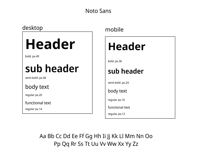
For my color, typeface, and design choices I wanted to make my product convey the feeling of a helpful and relaxed community that makes learning about the unfamiliar fun and exciting
Color Palette
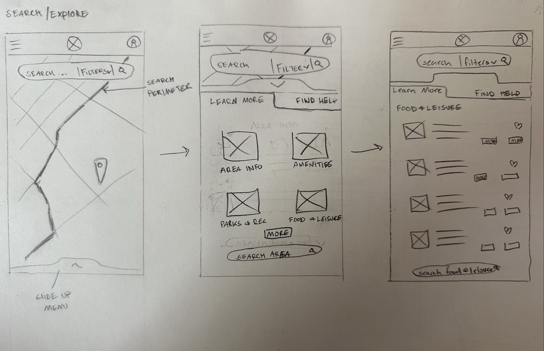
Low Fidelity Wireframing
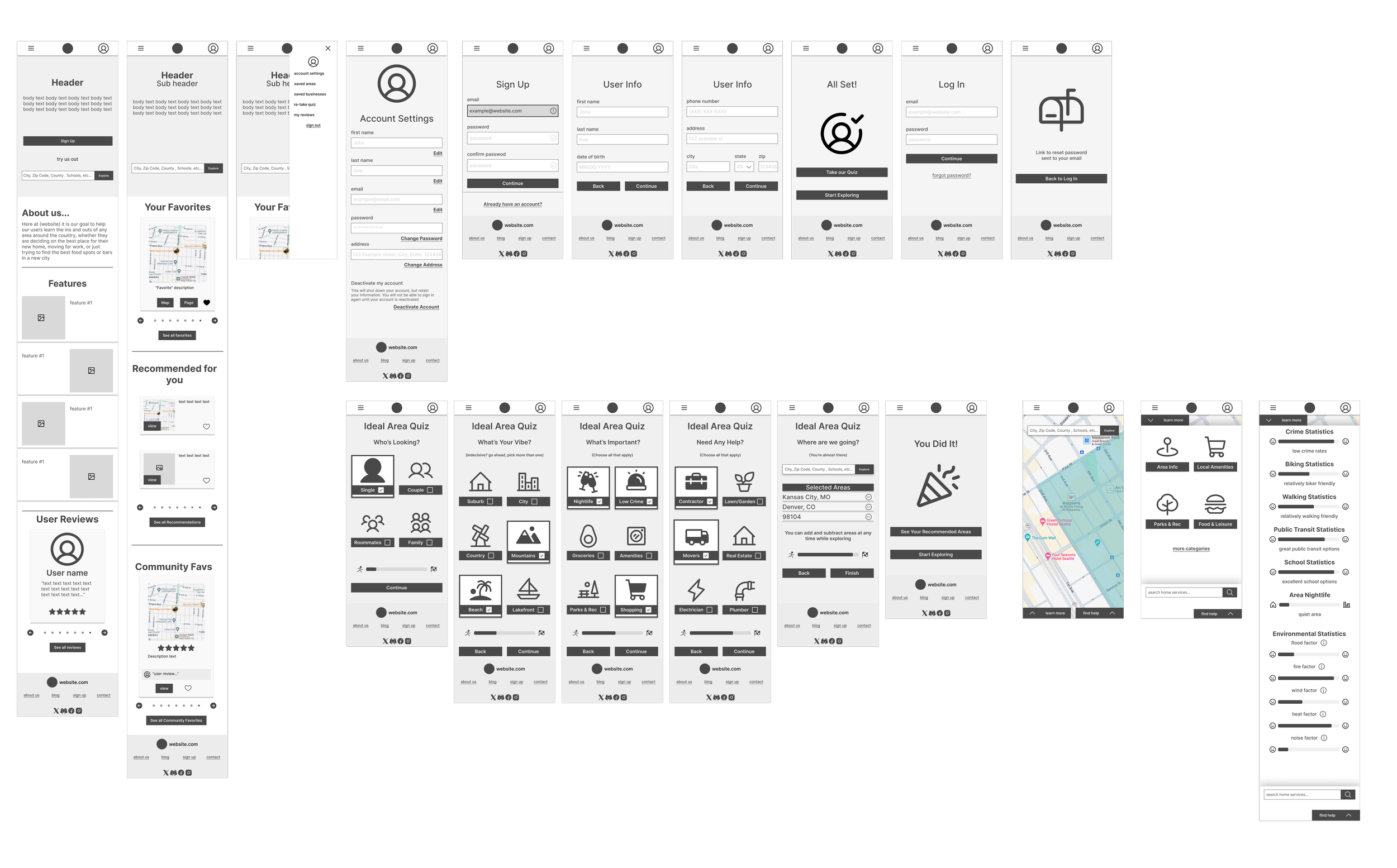
Mid Fidelity Wireframing
High Fidelity Wireframing
Logo Design
Wireframing
Typeface
Creating a Profile
Taking the HeyNeighbor "Ideal
Area Quiz"Looking up an area, and finding the area statistics for the searched area
Prototyping
After completing my High Fidelity wireframes, I built a prototype and recruited 5 participants and tasked them with 3 key tasks:
Success Metrics:
Time to complete prototype
Observing screen recording to identify areas participants may have found confusing
Feedback from participants after prototype completion
Prototyping Results
Usability Test Findings
Participants were able to complete all of the tasks
All of the icons and CTA were easily identifiable
Product type was clear and easy to read
Participants were able to create a new account without any errors or back tracking
Participants were able to complete the "Ideal Area Quiz" without any errors or back tracking
Most participants briefly struggled with locating the area map to complete the last task
Instead of using the "Start Exploring" CTA at the end of the "ideal area quiz" most users went back to the home page and accesses the map through the landing page search bar
Some users were didn't realize right away that "Area info" button led to the area statistics
One user recommended putting a way to exit the "area statistics" page at the bottom of the page so you don't have to scroll all the way back
Prototyping Iterations
Phrase Links to the area search maps more clearly
To speed up the time of completing tasks and avoid backtracking and confusion
Add a way to exit "area statistics page" at the bottom of the page
To allow users to quickly go back to the map after scrolling through all of the statistics page
Change "area info" CTA to "area statistics"
To make it more clear to users where to locate the area statistics page, to avoid second guessing and back tracking

